
Images - standalone components
There are a number of standalone image components available for use
Standalone image components
The following Image components are available:
- ImageFullWithText and ImageWithTextLH / ImageWithTextRH components can be used to add both images and text to a page. There are a couple of variations of the ImageWithText component, catering for the amount of text you have and whether the text of the first teaser is positioned on the LH or RH side of the image. The image in ImageWithTextLHV2 / ImageWithTextRHV2 is smaller and this component is to be used if you have less text to display
- The ImageTilesWithModal will display the image in a modal carousel. Any number of images can be added to the component, although consider the page size when doing so, and ensure the image files are as small as possible.
- Image Full Page (at end of page) needs to be added to a full width component and displays a very large image with text overlay
- ImageLink is to be used when you're wanting to link to a page and use an image to draw attention to the info.
- ImageTile is used purely to display a list of images on the page (there is no link)
- Image Library is a repository for displaying logos, icons and other imagery that your stakeholders eg the Media, may be interested in. Click here to view this component.
Image Full Width With Text - component heading (optional)
Introductory paragraph for the component goes here (optional)
Title goes here Teaser 2

You can include numerous paragraphs and spacing will adapt accordingly. If a link is required, add the link text and destination page. For your image load a full image set ie all 14 formats .
Add the detail here. You can include numerous paragraphs and spacing will adapt accordingly. If a link is required, add the link text and destination page.
Title goes here Teaser 3

You can include numerous paragraphs and spacing will adapt accordingly. If a link is required, add the link text and destination page. For your image load a full image set ie all 14 formats .
Add the detail here. You can include numerous paragraphs and spacing will adapt accordingly. If a link is required, add the link text and destination page.
Image with Text LH V2
There are 2 variations of the Image With Text LH component. The version 2 (V2) below has an image that is not as high as the 1st version. Image With Text LH V2 should be used when you don't have a lot of text to display next to the image . For your image load a full image set ie all 14 formats.
Image with Text LH V2 component heading goes here (optional)
Introductory paragraph for the component goes here (optional)
Title goes here Teaser 2
You can include numerous paragraphs and spacing will adapt accordingly. If a link is required, add the link text and destination page. For your image load a full image set ie all 14 formats .
Add the detail here. You can include numerous paragraphs and spacing will adapt accordingly. If a link is required, add the link text and destination page.
Title goes here
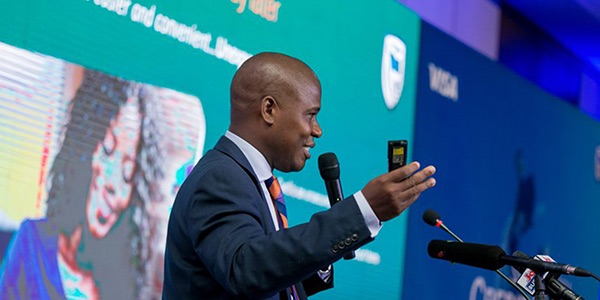
Add your content here. Try to balance the amount of text with the image. The text column will expand if more text is added than the height of the image. If link text and destination page is included, the link will be shown.
You can add any number of Teasers to this component.
Image with Text LH
The height of the image in the version of the component below, is higher than in V2 (version 2) above. Use the below variation when you have more text to poistion per image
Image With Text LH - component heading goes here (optional)
Introductory paragraph for the component goes here (optional)
Title goes here Teaser 3
You can include numerous paragraphs and spacing will adapt accordingly. If a link is required, add the link text and destination page. For your image load a full image set ie all 14 formats .
Add the detail here. You can include numerous paragraphs and spacing will adapt accordingly. If a link is required, add the link text and destination page.
Our Africa-China partnership
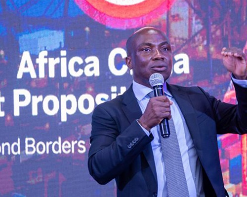
Standard Bank Group’s focus on Africa-China trade began more than a decade ago, where the significant opportunities Sino-Africa trade represented were recognized.
We formed a strategic partnership with the Industrial and Commercial Bank of China (ICBC), the world’s largest bank in terms of market capitalization. To confirm this partnership, ICBC became a 20% shareholder in Standard Bank in 2007.
Our Sponsorships
Standard Bank sponsored Ironman South Africa for a three-year period that commenced in January 2015. This saw Standard Bank supporting four key Ironman races annually in South Africa.
The Ironman sponsorship afforded Standard Bank the opportunity to be part of a global event, especially since the bank has a big focus on the African continent.
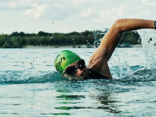
Image with Text RH V2
The Image With Text RH V2 and Image With Text RH components start with the text displayed on the RH side, alternating left and right thereafter. Use the V2 component template if you don't have lots of text to position next to the image
Image with Text RH V2 component heading goes here (optional)
Introductory paragraph for the component goes here (optional)
Tttle goes here
Try to balance the amount of text with the image. The text column will expand if more text is added than the height of the image. If link text and destination page is included, the link will be shown.
You can add any number of Teasers to this component. They will be displayed alternating the text from right to left.
Copy of Your Title needs to go here
Add some text here in the Description field. Add some text here in the Description field. Add some text here in the Description field. Add some text here in the Description field. Add some text here in the Description field. Add some text here in the Description field. Add some text here in the Description field. Add some text here in the Description field. Add some text here in the Description field. Add some text here in the Description field.

Title goes here Teaser 2
You can include numerous paragraphs and spacing will adapt accordingly. If a link is required, add the link text and destination page. For your image load a full image set ie all 14 formats .
Add the detail here. You can include numerous paragraphs and spacing will adapt accordingly. If a link is required, add the link text and destination page.
Image With Text RH
If you want this to appear on a white background add to a full width region
Image with Text RH component heading goes here (optional)
Introductory paragraph for the component goes here (optional)
Title goes here Teaser 2
You can include numerous paragraphs and spacing will adapt accordingly. If a link is required, add the link text and destination page. For your image load a full image set ie all 14 formats .
Add the detail here. You can include numerous paragraphs and spacing will adapt accordingly. If a link is required, add the link text and destination page.
Tttle goes here
Try to balance the amount of text with the image. The text column will expand if more text is added than the height of the image. If link text and destination page is included, the link will be shown.
You can add any number of Teasers to this component. They will be displayed alternating the text from right to left.
Our Africa-China partnership
Standard Bank Group’s focus on Africa-China trade began more than a decade ago, where the significant opportunities Sino-Africa trade represented were recognized.
We formed a strategic partnership with the Industrial and Commercial Bank of China (ICBC), the world’s largest bank in terms of market capitalization. To confirm this partnership, ICBC became a 20% shareholder in Standard Bank in 2007.
Our Sponsorships
Standard Bank sponsored Ironman South Africa for a three-year period that commenced in January 2015. This saw Standard Bank supporting four key Ironman races annually in South Africa.
The Ironman sponsorship afforded Standard Bank the opportunity to be part of a global event, especially since the bank has a big focus on the African continent.
ImageWithTextLHV3 (update this heading under the Component.Appearance
Title goes here Teaser 1 - ImageWithTextLHV3

Title goes here Teaser 1 - ImageWithTextLHV3
You can include numerous paragraphs and spacing will adapt accordingly. If a link is required, add the link text and destination page. For your image load a full image set ie all 14 formats .
Add the detail here. You can include numerous paragraphs and spacing will adapt accordingly. If a link is required, add the link text and destination page.
Title goes here Teaser 2 - ImageWithTextLHV3

Title goes here Teaser 2 - ImageWithTextLHV3
You can include numerous paragraphs and spacing will adapt accordingly. If a link is required, add the link text and destination page. For your image load a full image set ie all 14 formats .
Add the detail here. You can include numerous paragraphs and spacing will adapt accordingly. If a link is required, add the link text and destination page.
Title goes here Teaser 3 - ImageWithTextLHV3

Title goes here Teaser 3 - ImageWithTextLHV3
You can include numerous paragraphs and spacing will adapt accordingly. If a link is required, add the link text and destination page. For your image load a full image set ie all 14 formats .
Add the detail here. You can include numerous paragraphs and spacing will adapt accordingly. If a link is required, add the link text and destination page.
Image Tiles With Modal
Caption goes here
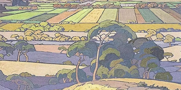
Watercolour farmlands
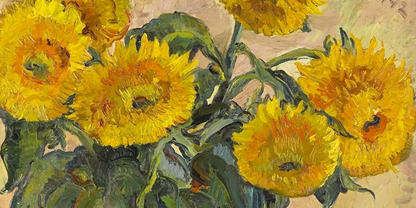
Gladioli
Richtersveld landscape
What is this?
Imagelink, ImageLinkV2 and Imagetile components
Please see key differences between the components below :
- Image Link - uses an image to position a link (ie there is a link behid this image)
- Image Link V2 - also uses an image to position a link. However no text is overlayed on the image. If text is required, it should already be embeded on the image jpgs that are uploaded into the WEM
- ImageTile - has no link - is just used to display an image
Image Link component heading
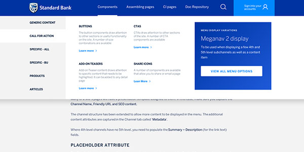
Image Tile component heading
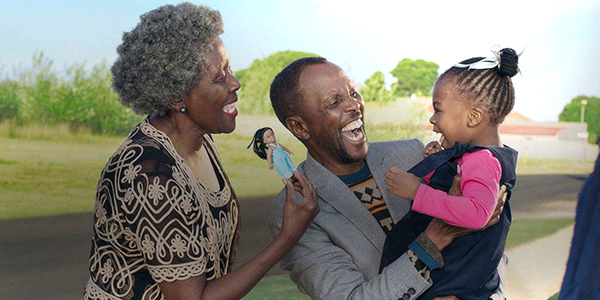
The family is the most important social unit of society
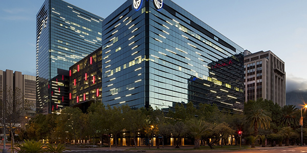
Standard Bank Offices, 30 Baker Street
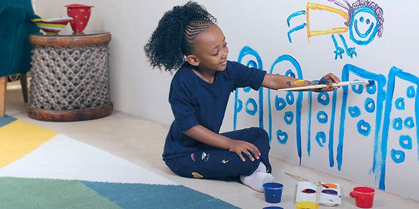
Let your child explore their artistic skills JS
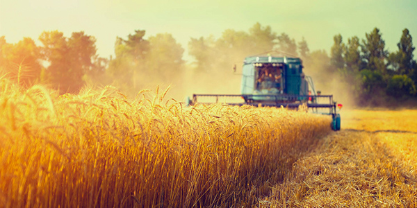
The crops are ready to be harvested
Image Full page component (below)
The image uploaded in the teaser is displayed in the background. You add the text and links that are overlayed on the image.
how to Add the component to your page:
- Drag and drop the Image FULL PAGE component template, into a full width region
- CLONE the SBG CONTENT LIST
- Under Related Content -> CLONE the SBG Teaser - it contains the full page IMAGE and the TEXT that is overlayed on the image. The main button link comes from the Link in the Teaser. Replace the content in your cloned teaser with your own.
- Under Related Links -> UPDATE the link urls for the 'Download the App' functionlaity. If the Download the App Links are not required, remove the 2 links under Related Links.
- NOTE: If any of the fields are not populated, the spacing is adjusted accordingly.
- In order to get the enboldened styling, add the following css markup around the words <b> your content that needs to be enboldened </b>
- TEXT ALIGNMENT on the image
- The placement of the text on the image can be either: left, centre or right aligned
- The default alignment will be LEFT.
- You can change the alignment under the Presentation Properties -> Text1Aligement
- In order to get the enboldened styling, add the following css markup around the words <b> your content that needs to be enboldened </b>
- PADDING below the image
- The component caters for configuring whether padding should be included below the image or not
- The default setting will be 'yes' ie to display the padding
- You can change this to not display padding, under the Presentation Properties -> set BottomPadding=no
Image requirements
File size
- The above component uses a FULL PAGE image size.
- When sourcing this image file, make sure the focal point is centred or slightly to the left, as the right hand size of the image file is cropped off when displayed on tablet and mobile devices
- This FULL PAGE image size is not included in the 14 image file size set. It is a new size, required ONLY for the components that use a Full page image ie Image Full Page and the Campaign Vertical Scroller component
| Media Format | File size |
|---|---|
| Landscape_FullPage | 939x486 |
Note: The opacity overlay on the image file is added by the component – ie content editors don’t need to add an overlay to the image file that is cropped.
Image media item to capture
- The same size format is displayed across Desktop, Tablet and Mobile
- You therefore only need to upload ONE format, specifying the Media Format = Landscape_FullPage