


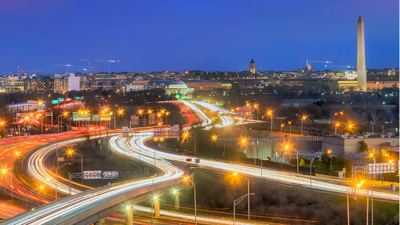


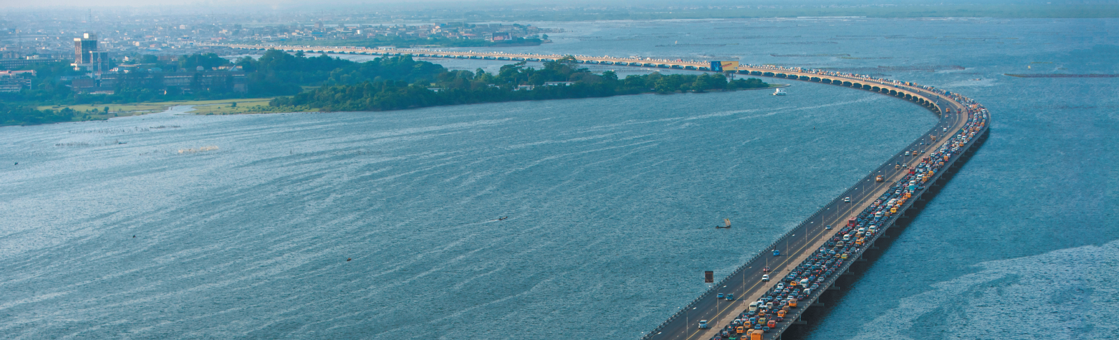


Hero banners
The different types and purpose of the hero banners are displayed above. They need to be added manually to the full width region at the top of the page - contentRegion1.
How to setup - Banner Image Full With Overlay
The BannerHeroImageFullWithOverlay or BannerMidpageImageFullWithOverlay components are enhancements of the Banner Image Full components. They have been enabled to display an overlay on a banner that has too light a background causing the white banner text to be unclear or unreadable.
The overlay can be specified per banner in the carousel ie it does not need to be applied to all the banners in the carousel.
You specify if the overlay needs to be applied, by changing the relevant BannerOverlay property ‘setting’ to ‘Yes’. The banner properties are found under the Presentation Properties tab of the component. There are 5 banner properties available.
If you are going to need to apply an overlay to your full width banners, then use this new component for all your full width banners going forward and just update the Presentation Properties if you need the overlay. You will, of course, need to remember to update the properties when you add or remove banners and the positions change etc.
Banner Image FULL
Note that BannerHeroImageFull and BannerMidpageImageFull will display full width, even if they are not added to a full width region
How to setup Banner Hero Image Full With NO main Carousel
The Banner Hero Image Full with NO main Carousel is a new variant of the Banner Hero Image Full. It displays multiple banners, but as seen above, it does not use the usual carousel
- Banner 1 in your list will display full screen, ie not within a carousel
- Banners 2,3,4,5 etc will be displayed below the main banner
- If you have more than 4 banners in the component, carousel controls will be displayed next to the small banners, enabling the user to scroll right or left to view the others
- If you load only 2 or 3 banners in the component, the smaller banners will be centre aligned below the main one
- Image requirement - in order to display the smaller banners, you need to add another media format ie image size, to your image for the banner. All you need to capture is:
- Media format = Portrait_sq and then pull the relevant Portrait_sq image size
- The main banner can have an overlay applied, if required. You specify if the overlay needs to be applied, by setting the Banner1Overlay property to ‘Yes’. This banner property is found under the Presentation Properties tab of the component. By default the Banner1Overlay property = 'No'