Add-ons for Product
Add-On Product
The AddOn Product component is used to highlight another product that complements the product the customer is looking at eg Insurance for a Home Loan. It will display only an SBG Product content item and needs to be placed next to 3 tabs on the product detail page or a Rich Text Partial component. Also view the AddOn teaser components which provide more flexibility for the content displayed
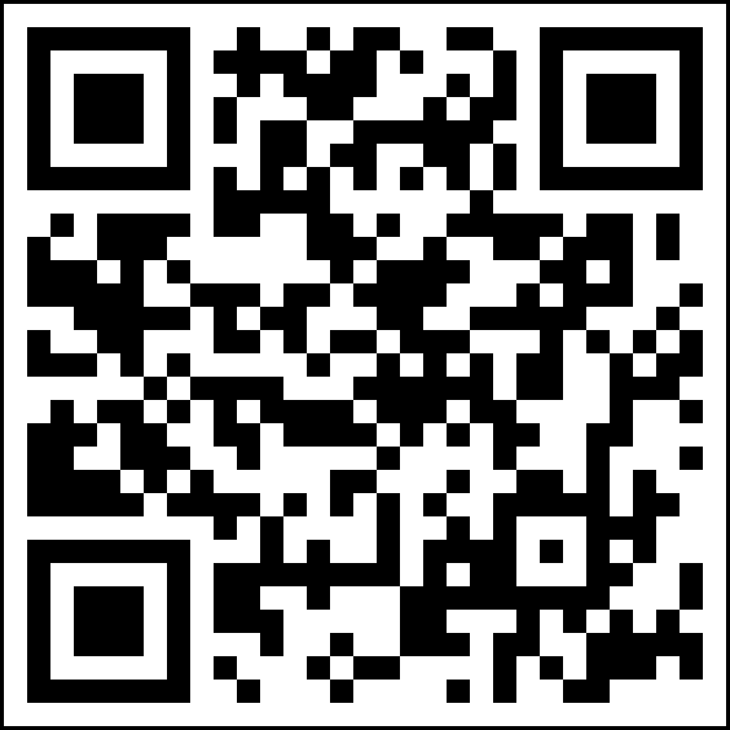
AddOn - Get App QR Code components
There are 2 "Get App QR Code" components:
- Get App QR Code - One Link
- Get App QR Code - Multi Links
They can be positioned next to the tabs on a Product Detail page. They can also be placed next to a Rich Text Partial component.
How to assemble:
- The Get App QR Code components use an SBG Content List with max 3 links. Each link contains the relevant link to the App Store, should users click on the App Store icon (rather than scan the QR code).
- For the Multi QR code one, each link must also contain the relevant QR code image. For the Single QR code component any link can contain the QR code image, preferably the 1st one
- The recommended image size for the QR code is 240x240px, but anything up to 300x300px is catered for, and will be resized accordingly.
- When assembling the image, add the QR code file as the Source File (ie no formats are required)
- Tabs are used to group and summarise important information, listing the key features, costs, qualifyng criteria, application process, etc or whatever is relevant for the particular product.
- This is the content for the 1st tab, which is populated from the description field.
- A max of 5 tabs can be displayed. Tabs are only displayed if populated with content.
- Keep the list of bullets per tab to a minimum – 6/7 is the recommended maximum (although there is no technical limitation). If 2 columns of bullets are required, please contact the Support team for assistance to add some html/css to group the content accordingly.
- Note that the height of the tab component will be determined by the tab with the longest list of information/bullets eg if tab 3 has 10 bullets and tab 1 only 3 bullets, then tab 1 will have lots of white space displayed below the bullets.)
- Some recommended tab groupings are:
- Tab 1 : What you get / What’s covered / How it works
- Tab 2: What it costs
- Tab 3: How to get it / What you’ll need
- Tab 4: Discounts / Exclusions
- Tab 5: How to claim
- This is the content for the 2nd tab. It goes in the description field.
- Apply the bullet styling.
- This is the content for the 2nd tab. It goes in the description field.
- Apply the bullet styling.
- This is the content for the 2nd tab. It goes in the description field.
- Apply the bullet styling.
- This is the content for the 2nd tab. It goes in the description field.
- Apply the bullet styling.
- This is the content for the 3rd tab. It goes in the description field.
- Apply the bullet styling.
- This is the content for the 3rd tab. It goes in the description field.
- Apply the bullet styling.
- This is the content for the 3rd tab. It goes in the description field.
- Apply the bullet styling.
- This is the content for the 3rd tab. It goes in the description field
-
Tab 1 label
-
Tab 2 label
-
Tab 3 label
- Tabs are used to group and summarise important information, listing the key features, costs, qualifyng criteria, application process, etc or whatever is relevant for the particular product.
- This is the content for the 1st tab, which is populated from the description field.
- A max of 5 tabs can be displayed. Tabs are only displayed if populated with content.
- Keep the list of bullets per tab to a minimum – 6/7 is the recommended maximum (although there is no technical limitation). If 2 columns of bullets are required, please contact the Support team for assistance to add some html/css to group the content accordingly.
- Note that the height of the tab component will be determined by the tab with the longest list of information/bullets eg if tab 3 has 10 bullets and tab 1 only 3 bullets, then tab 1 will have lots of white space displayed below the bullets.)
- Some recommended tab groupings are:
- Tab 1 : What you get / What’s covered / How it works
- Tab 2: What it costs
- Tab 3: How to get it / What you’ll need
- Tab 4: Discounts / Exclusions
- Tab 5: How to claim
- This is the content for the 2nd tab. It goes in the description field.
- Apply the bullet styling.
- This is the content for the 2nd tab. It goes in the description field.
- Apply the bullet styling.
- This is the content for the 2nd tab. It goes in the description field.
- Apply the bullet styling.
- This is the content for the 2nd tab. It goes in the description field.
- Apply the bullet styling.
- This is the content for the 3rd tab. It goes in the description field.
- Apply the bullet styling.
- This is the content for the 3rd tab. It goes in the description field.
- Apply the bullet styling.
- This is the content for the 3rd tab. It goes in the description field.
- Apply the bullet styling.
- This is the content for the 3rd tab. It goes in the description field
-
Tab 1 label
-
Tab 2 label
-
Tab 3 label
- Tabs are used to group and summarise important information, listing the key features, costs, qualifyng criteria, application process, etc or whatever is relevant for the particular product.
- This is the content for the 1st tab, which is populated from the description field.
- A max of 5 tabs can be displayed. Tabs are only displayed if populated with content.
- Keep the list of bullets per tab to a minimum – 6/7 is the recommended maximum (although there is no technical limitation). If 2 columns of bullets are required, please contact the Support team for assistance to add some html/css to group the content accordingly.
- Note that the height of the tab component will be determined by the tab with the longest list of information/bullets eg if tab 3 has 10 bullets and tab 1 only 3 bullets, then tab 1 will have lots of white space displayed below the bullets.)
- Some recommended tab groupings are:
- Tab 1 : What you get / What’s covered / How it works
- Tab 2: What it costs
- Tab 3: How to get it / What you’ll need
- Tab 4: Discounts / Exclusions
- Tab 5: How to claim
- This is the content for the 2nd tab. It goes in the description field.
- Apply the bullet styling.
- This is the content for the 2nd tab. It goes in the description field.
- Apply the bullet styling.
- This is the content for the 2nd tab. It goes in the description field.
- Apply the bullet styling.
- This is the content for the 2nd tab. It goes in the description field.
- Apply the bullet styling.
- This is the content for the 3rd tab. It goes in the description field.
- Apply the bullet styling.
- This is the content for the 3rd tab. It goes in the description field.
- Apply the bullet styling.
- This is the content for the 3rd tab. It goes in the description field.
- Apply the bullet styling.
- This is the content for the 3rd tab. It goes in the description field
-
Tab 1 label
-
Tab 2 label
-
Tab 3 label
- Tabs are used to group and summarise important information, listing the key features, costs, qualifyng criteria, application process, etc or whatever is relevant for the particular product.
- This is the content for the 1st tab, which is populated from the description field.
- A max of 5 tabs can be displayed. Tabs are only displayed if populated with content.
- Keep the list of bullets per tab to a minimum – 6/7 is the recommended maximum (although there is no technical limitation). If 2 columns of bullets are required, please contact the Support team for assistance to add some html/css to group the content accordingly.
- Note that the height of the tab component will be determined by the tab with the longest list of information/bullets eg if tab 3 has 10 bullets and tab 1 only 3 bullets, then tab 1 will have lots of white space displayed below the bullets.)
- Some recommended tab groupings are:
- Tab 1 : What you get / What’s covered / How it works
- Tab 2: What it costs
- Tab 3: How to get it / What you’ll need
- Tab 4: Discounts / Exclusions
- Tab 5: How to claim
- This is the content for the 2nd tab. It goes in the description field.
- Apply the bullet styling.
- This is the content for the 2nd tab. It goes in the description field.
- Apply the bullet styling.
- This is the content for the 2nd tab. It goes in the description field.
- Apply the bullet styling.
- This is the content for the 2nd tab. It goes in the description field.
- Apply the bullet styling.
- This is the content for the 3rd tab. It goes in the description field.
- Apply the bullet styling.
- This is the content for the 3rd tab. It goes in the description field.
- Apply the bullet styling.
- This is the content for the 3rd tab. It goes in the description field.
- Apply the bullet styling.
- This is the content for the 3rd tab. It goes in the description field
Rich Text on page - Partial
This is dummy text. First CLONE this content item and then you can overwrite it by adding your paragraphs here.
Standard Bank Group is the largest African banking group by assets, with a market cap of approximately R310 billion (USD23 billion), offering a range of banking and related financial services across sub-Saharan Africa.
Our strategy is to be an African focused, client-centred, digitally enabled universal financial services organisation, which drives Africa’s growth and creates value for all our stakeholders. Our clients are at the centre of everything we do. This is our central organising principle in building a digitally enabled universal financial services organisation. It aligns our efforts to change the way we do things, develop our people and shift our culture, and ultimately create a sustainable competitive advantage in a changing industry.
We have a 155-year history in South Africa, and started building a franchise in sub-Saharan Africa almost 30 years ago. We have an on-the-ground presence in 20 countries on the African continent, and solid local knowledge required to operate a successful business in Africa.


