Midpage banners
The different types and purpose of the midpage banners are displayed below. They are always added manually and are not full width components (see exception below)
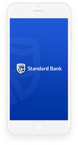
Banner Get App
- To use, clone the content in the relevant Banner Get App component template
- The content item is an SBG Content List. The Banner content and image get captured into an SBG Banner under the Related Content and the 3 links are added under the Related Links tab
- Replace the App Store destination links with your links, if they differ from the Group App links
- App Store icons: You don't need to upload the icon for the App Store. The relevant icon is obtained using the Link Class Name which is already populated in the component template. For ease of reference, these are the Link Class Names:
- Apple App Store - uses the Link Class Name = app-store-badge
- Google Play - uses Link Class Name = google-play-badge
- Huawei Gallery - uses Link Class Name = huawei-app-gallery
Image requirement
If you are replacing the image, then the following 3 jpg sizes are required for the phone image:
- Desktop – 380 x 480 px
- Tablet – 226 x 282 px
- Mobile – 290 x 290 px
When assembling the image media item displayed in the banner, you need to
- Specify the TARGET DEVICE for each format you add to the image (as you do for banners)
- You need to add THREE formats – one for Desktop, one for Tablet, one for Mobile. Add the Desktop format as the Source format

Try our great Digital Banking Services. It’s great for things like…
- Applying for pre-approval on financing your next car
- Calculating and managing your repayments
- Getting cross-border letters or settlement quotes
- Get it now and bank anywhere, anythime
3 Step Promo banner - with ICON AND main link
3 Step Promo Banner - with ICON BUT no main link
Promo ucount banner - with main link

Add the main description here for this banner element
Place a short description of what you are promoting here. The whole element will be hyperlinked with the link destination you specify under Link To
Place a short description of what you are promoting here. The whole element will be hyperlinked with the link destination you specify under Link To
Place a short description of what you are promoting here. The whole element will be hyperlinked with the link destination you specify under Link To
Promo ucount Banner - with no Tell me More link

Add the main description here for this banner element
Place a short description of what you are promoting here. The whole element will be hyperlinked with the link destination you specify under Link To
Place a short description of what you are promoting here. The whole element will be hyperlinked with the link destination you specify under Link To
Place a short description of what you are promoting here. The whole element will be hyperlinked with the link destination you specify under Link To
Banner Promo Overlay
This is a promotional banner, that draws attention to a particular product or promotion that is being advertised. It is to be used on the inner pages of your site.
Upon page load, the banner will be docked as an overlay at the bottom of the screen. The ‘screen’ below the overlay will still be active and accessible. The user will be able to close the overlay, once they’ve read it, or if they are not interested.
If the user returned to that page at a later stage, they would be shown the overlay again, ie we do NOT require any cookie management to determine whether the overlay should be hidden or displayed.
Banner midpage Image Full With Overlay - how to setup
The BannerMidpageImageFullWithOverlay component is an enhancement of the Banner Midpage Image Full component. It has been enabled to display an overlay on a banner that has too light a background causing the white banner text to be unclear or unreadable.
The overlay can be specified per banner in the carousel ie it does not need to be applied to all the banners in the carousel.
You specify if the overlay needs to be applied, by changing the relevant BannerOverlay property ‘setting’ to ‘Yes’. The banner properties are found under the Presentation Properties tab of the component. There are 5 banner properties available.
If you are going to need to apply an overlay to your full width banners, then use this new component for all your full width banners going forward and just update the Presentation Properties if you need the overlay. You will, of course, need to remember to update the properties when you add or remove banners and the positions change etc.


